Case study · Brand & spot · 100% AI
Koa
A fictional artisan chocolate house built from cacao and pistachio — identity, packaging and launch film all generated and art-directed with AI, from the first sketch of the logotype to the final grade of the spot.
01 · The idea
A whole chocolate house, imagined before a single bar was poured.
Koa is a self-initiated case study: a fictional artisan chocolate brand pairing single-origin cacao with pistachio. The goal was to prove a full brand launch — naming, mark, packaging, photography and film — can be directed end to end with generative tools, without losing the craft feel of a real atelier.
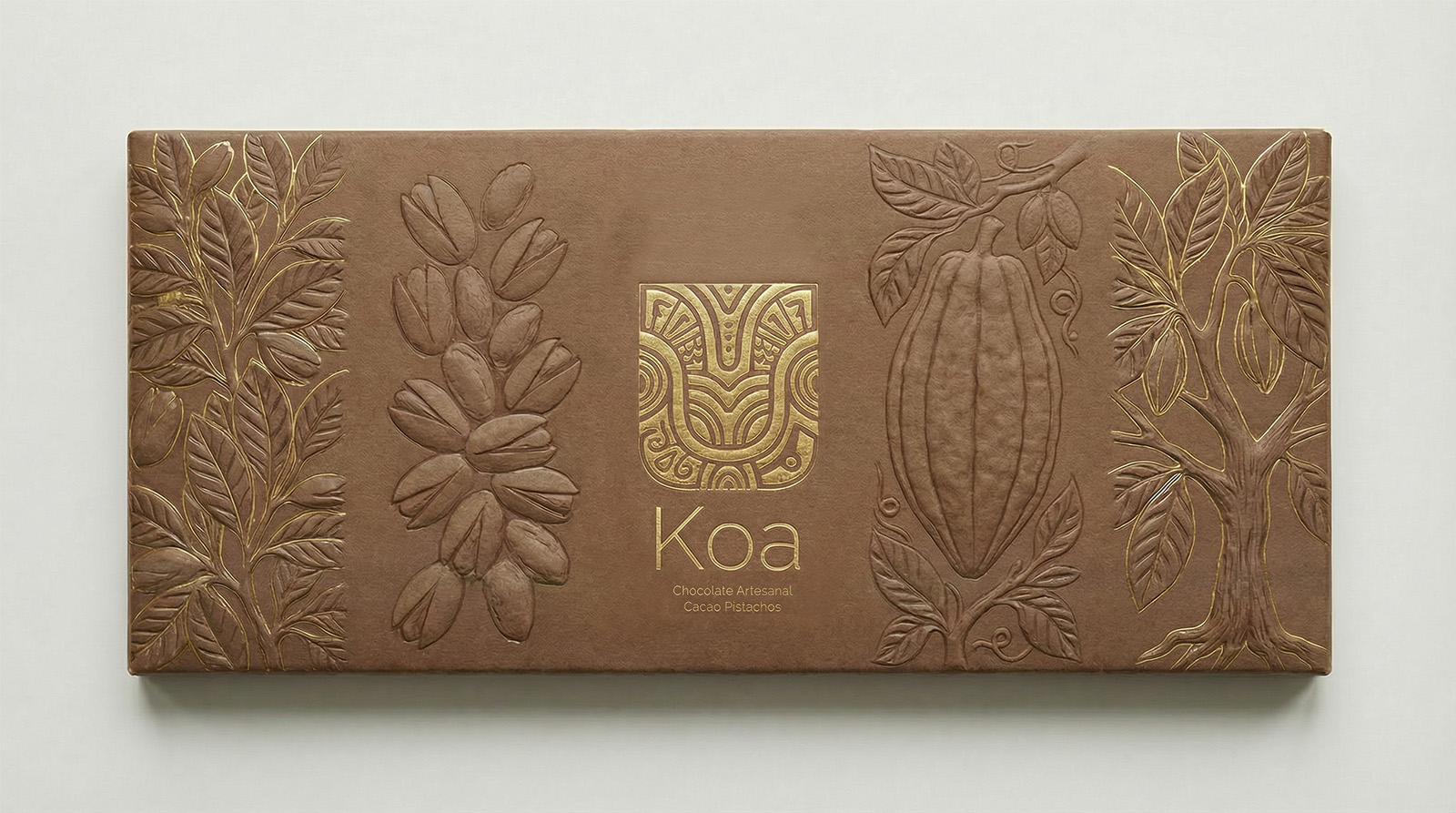
The name nods to the cacao tree itself; the mark is a hand-carved glyph pressed in gold foil, echoing the engraved bars at the centre of the brand. Every asset — logo, bar embossing, packaging mockups and the launch spot — was generated and then curated, graded and composed by amstudio.
02 · The mark
Engraved in gold, embossed in chocolate.
The Koa glyph reads like a carved stamp — part woodcut, part cacao pod in cross-section. It's foiled in gold on the outer sleeve, then pressed straight into the bar itself alongside hand-drawn cacao leaves, pistachio clusters and the tree in full leaf.
03 · The world
Everything melts back to the mark.
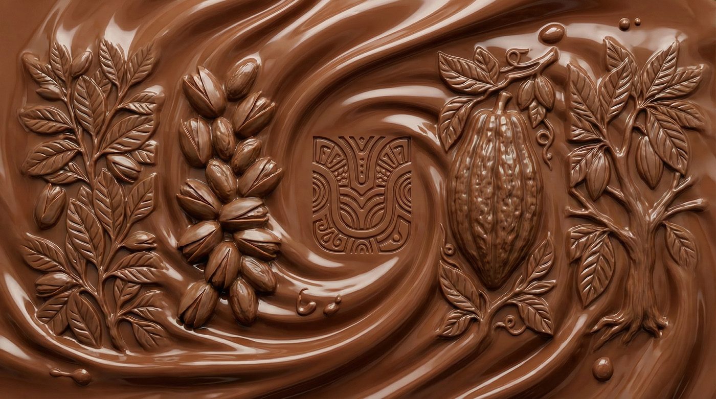
Every key visual finds its way back to molten chocolate swirling around the glyph, the leaves and the pistachio cluster — the same carving from the bar, now liquid. It's the throughline that ties packaging stills to the film's macro shots.
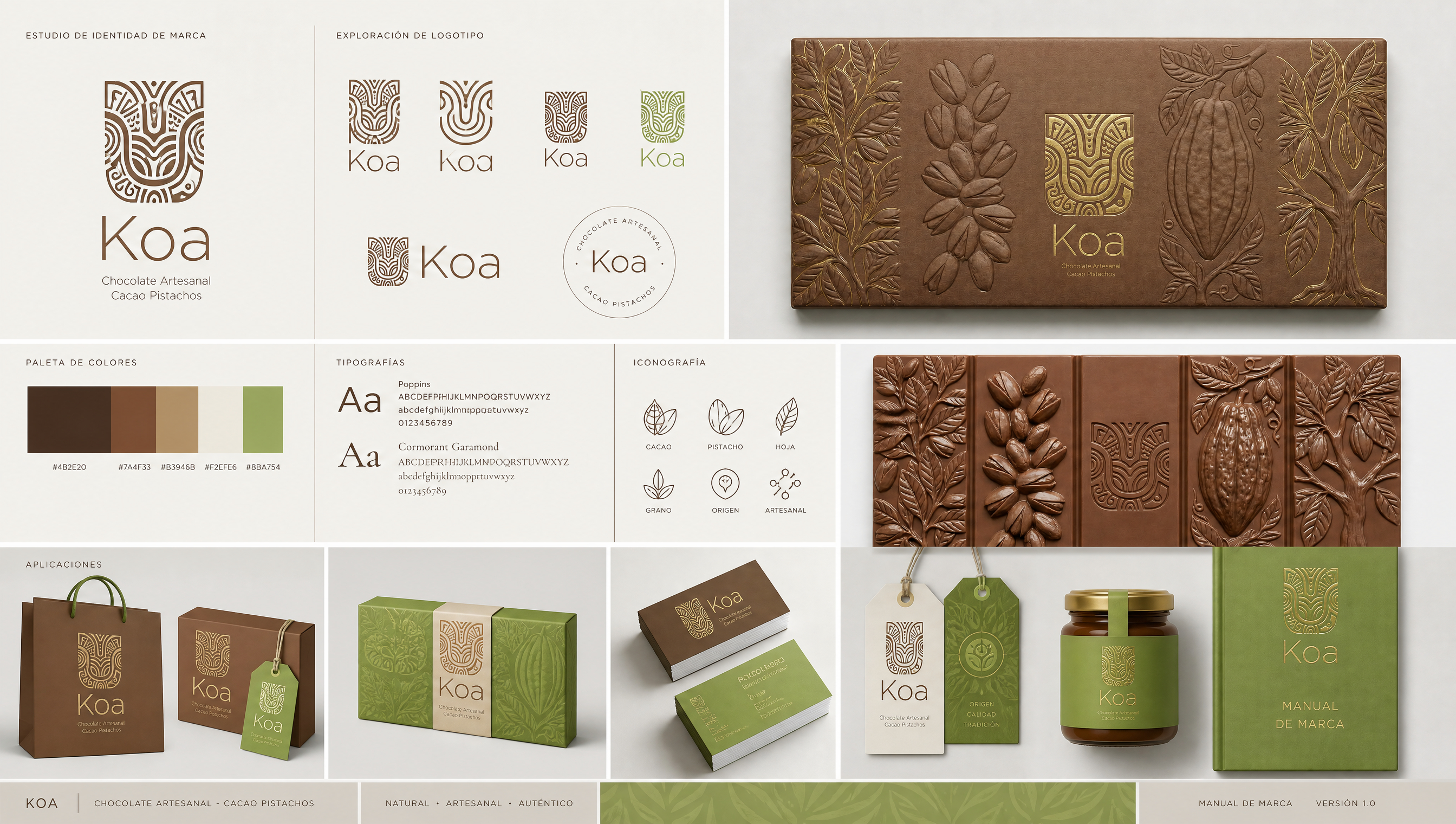
Motion studies and the full identity system, side by side.
04 · The pipeline
STEP 01
Naming & mark
Dozens of logotype generations narrowed to one carved glyph.
STEP 02
System & palette
Colour, type and iconography locked into a manual de marca.
STEP 03
Packaging
Bar, box, bag and jar mockups rendered in the same emboss.
STEP 04
The spot
Macro motion, edit and grade for the launch film.
Want a brand like this?